The loading screen that frames your checkout as secure
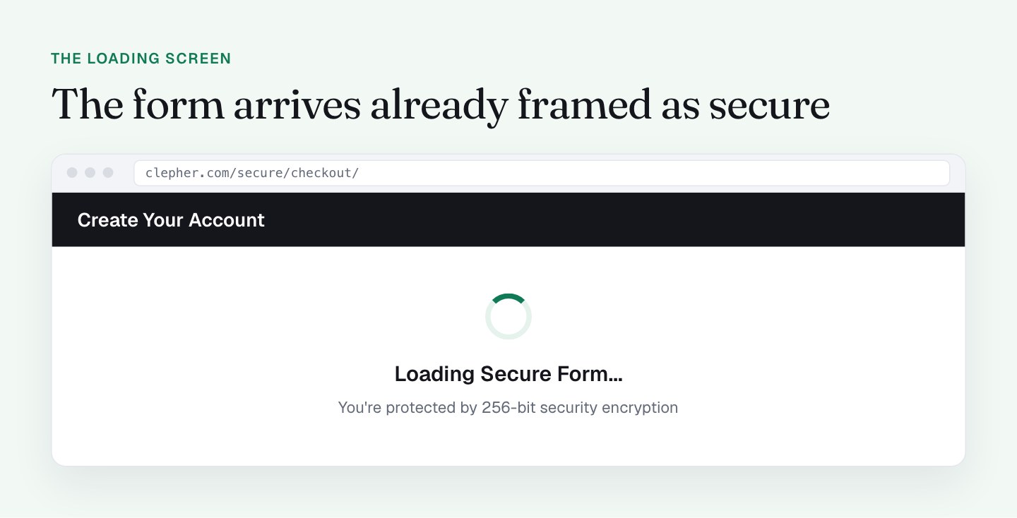
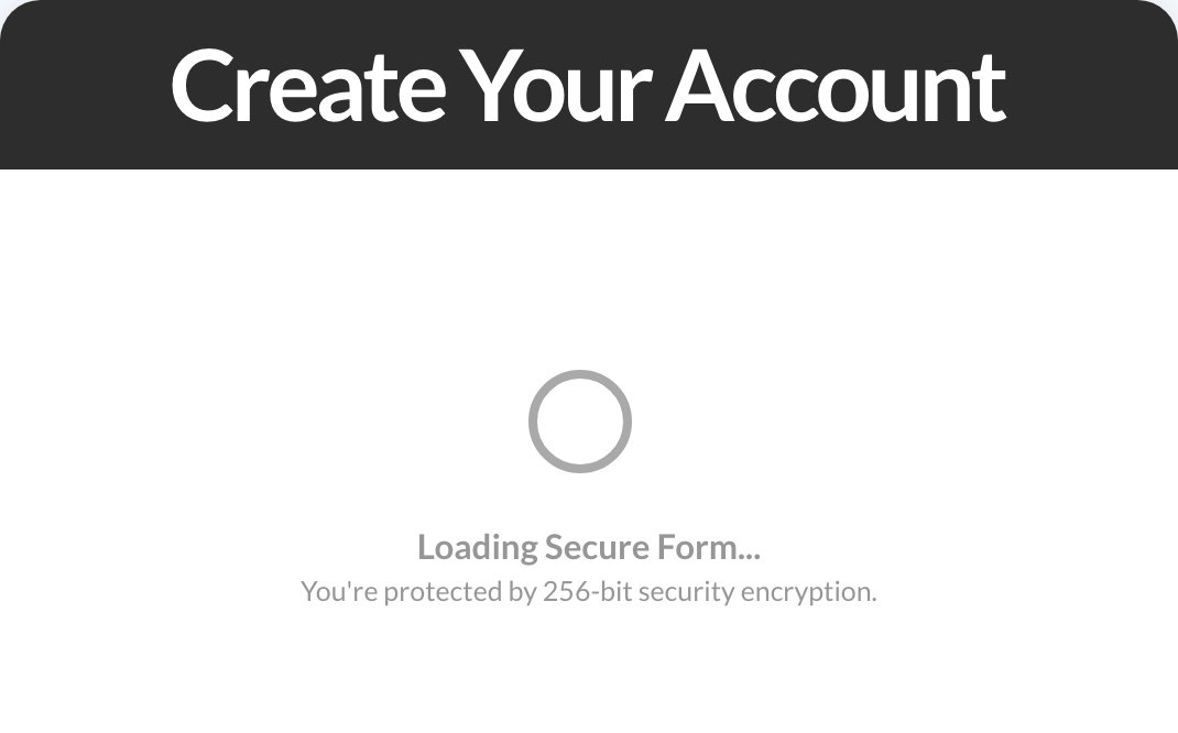
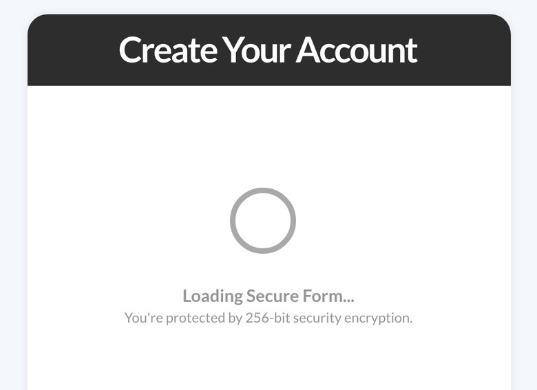
A checkout loading screen is a short screen shown before the payment form appears. Mine says "Loading Secure Form..." with a line about 256-bit encryption, and I think it sets the right frame before a buyer ever sees a card field.
My Clepher checkout opens with that screen, and then the form appears. The moment someone lands on a checkout page is the moment they decide whether to trust it, so I wanted to understand exactly what this screen does.
Why show a loading screen before a checkout form?
A payment form asks for the most sensitive thing a buyer ever hands over: their card. The page that asks for it has a few seconds to make that feel safe.
The loading screen uses those seconds. Under a black "Create Your Account" bar, the buyer sees a spinner and a plain-language security message. By the time the fields show up, the first thing the buyer has read about the form is that it's secure. I like that sequence. The form arrives already framed.
This is my read of why it helps, not a measured result. What I do have is a checkout converting 50 to 60% of visitors, with this screen in the flow, and I'm not going to remove it on a hunch.
What I do on my checkout
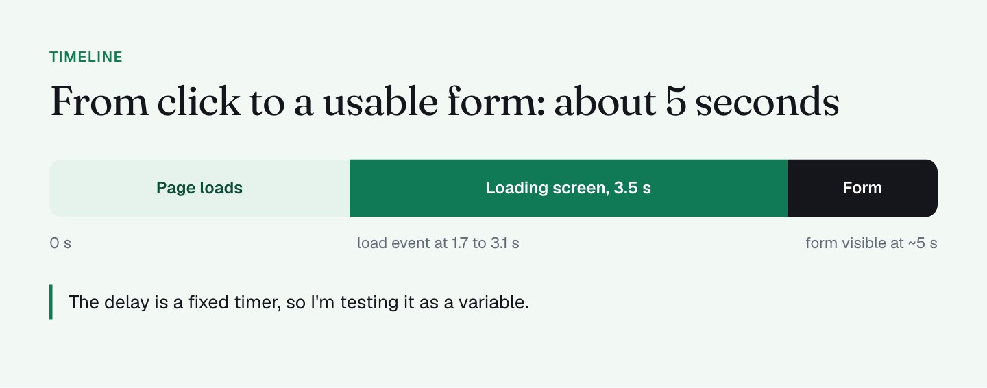
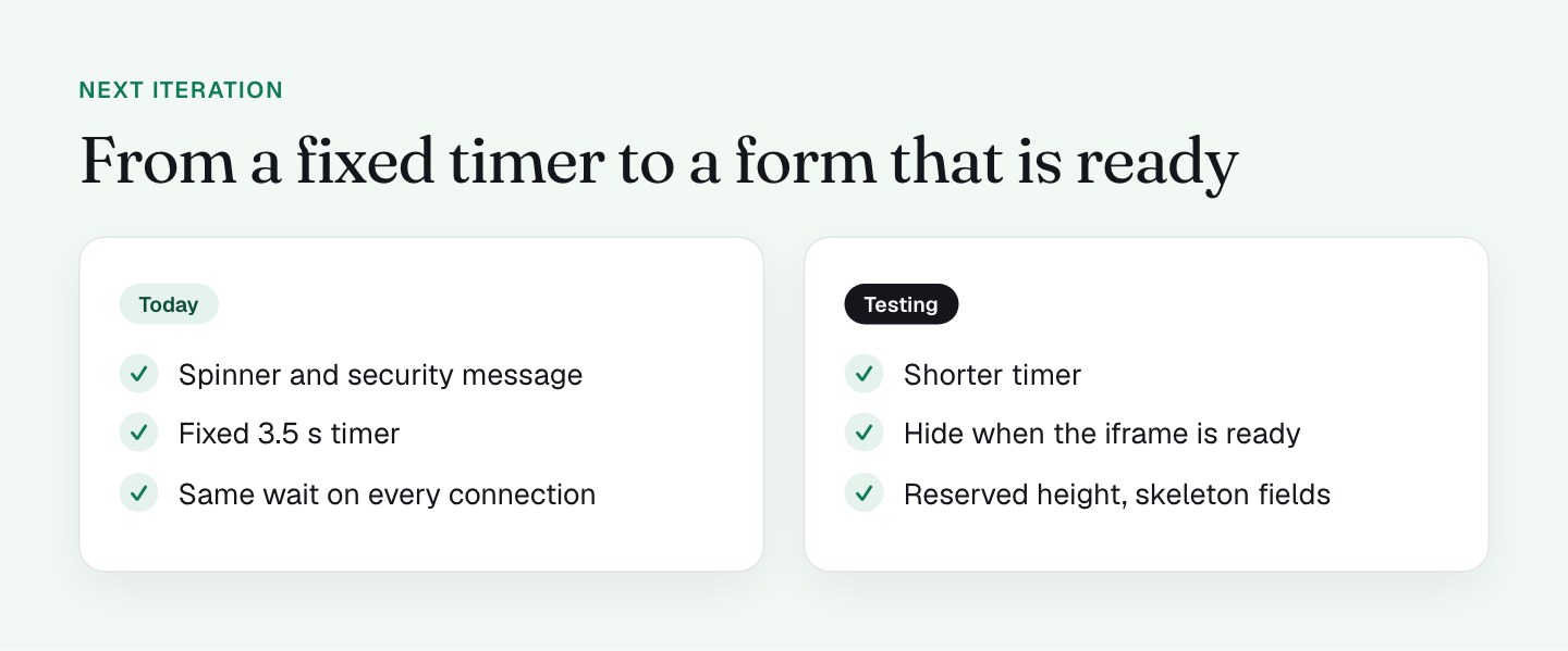
The form is an embedded PayKickstart checkout inside an iframe. The loading screen is a short timer: a setTimeout(3500) keeps the form container hidden for 3.5 seconds, and the form becomes visible about 5 seconds after navigation. It's the same on desktop and mobile.
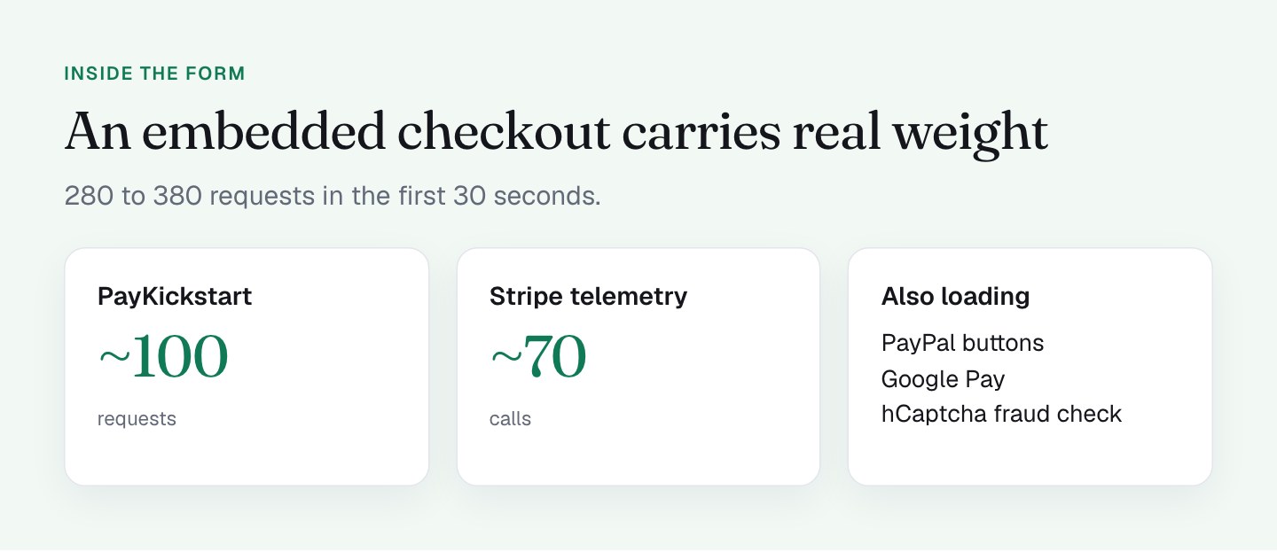
There's real weight behind the form too, which is why a settled arrival matters. In the first 30 seconds I counted about 280 to 380 requests including the iframes. Stripe's Payment Element, PayPal's buttons, hCaptcha for Stripe's fraud checks and Google Pay all load in there. An embedded form like that can resize and refill as it loads, and showing it only once it has settled gives the buyer a clean, finished form instead of a half-built one.
The main page itself is done early, with the load event at roughly 1.7 to 3.1 seconds. So the loading screen covers the stretch where the form is getting ready.
The trust bar sits above it on every screen size: instant access, a 30-day money-back guarantee, secure order. The buyer gets reassurance before they see a single field.
What I'll do differently
The audit gave me a clear next step: the delay is a fixed timer, not a measurement of when the form is ready. That means it's the same 3.5 seconds on a fast connection as on a slow one. So I'm testing it as a variable.
1. Test a shorter timer. I'll run the loading screen at a shorter length and compare completed orders. If 3.5 seconds is the sweet spot, I keep it. If the framing works at 1.5, I just gained seconds back for every buyer. I'd rather decide with a split test than with a guess.
2. Tie it to the form being ready. Instead of a fixed time, the screen can hide when the iframe signals it's loaded and settled. That keeps the "secure" framing and removes the wait on fast connections.
3. Reserve the space. I'm giving the form container a fixed minimum height, so the page doesn't shift when the form arrives. That makes the transition feel finished.
4. Swap the spinner for a skeleton. Gray placeholder bars in the shape of the fields show the buyer what's coming. The security message can stay on top.
5. Defer what isn't needed to type. Telemetry, wallet scripts and fraud checks (Stripe telemetry alone was about 70 calls) don't need to compete with the visible form. I want to see which of those can load after the buyer has started typing.
How do you measure checkout form load time?
Page load time isn't the number that matters for a checkout. "Form visible and usable" is. To measure it, open your checkout in a private window, throttle to a mid-range mobile connection, start a stopwatch when you press enter, and stop it when you can type in the first field. Do it 5 times and take the middle result.
Write that number next to whatever your speed tool reports. If they differ by more than a second, you've found a variable worth testing, not a problem to hide. If you've added query parameters to your link, test that version too, as I covered in part 1.
A note on copying this
Don't read this as "add a fake delay to your checkout." My loading screen sits in front of a heavy embedded form, and I'm testing how long it should last. The principle I'd take from it is: think about what the buyer sees and reads in the first seconds, and make those seconds do work. Whether that takes 3.5 seconds, 1.5 or none is something your own test should answer.
What to check on your own checkout
- Time from clicking your link to being able to type in the first field. Not page load: field ready.
- Look in your page code for
setTimeoutand see what it hides or shows. - Check whether your form container has a reserved height, or whether the page jumps when the form arrives.
- Count the requests your checkout makes in the first 30 seconds, and which vendors they belong to.
- Read what your buyer reads in the first 3 seconds. Does it build trust or just fill time?
- Test on a throttled mobile connection, not just your office Wi-Fi (more on phones in what to sacrifice on mobile).
Once the form shows up, the next question is where it sits: form left, pitch right.
FAQ
Should a checkout page show a loading screen?
It can help when the form is an embedded iframe that resizes and refills as it loads, because the buyer sees a finished form instead of a half-built one. The screen should also reassure the buyer. I'd test its length rather than guess.
How long should a checkout form take to appear?
There is no universal number, and I'd rather test than quote one. On my checkout the form is visible about 5 seconds after navigation, and I'm testing a shorter timer against it. The aim is the shortest wait that still shows a settled form.
How do you measure checkout form load time?
Open the checkout in a private window with the network throttled to a mid-range mobile connection. Start a stopwatch when you press enter and stop it when you can type in the first field. Do it 5 times and take the middle result.
What slows down an embedded checkout form?
Third-party scripts do. On my checkout, PayKickstart makes about 100 requests, Stripe telemetry about 70 calls, and PayPal, Google Pay and hCaptcha load too. Deferring what is not needed to type a name and email helps the visible form arrive sooner.