Mobile checkout design that puts the form first
Good mobile checkout design puts the form first and the pitch second. On a phone you cannot show everything, so you decide what comes first, what moves down, and what disappears. My checkout makes that decision correctly on the most important point, and I think it is one of the smartest things on the page.
Why does a form-first mobile checkout work?
A buyer who tapped a link to a checkout wants to pay. If the first screen is a long sales pitch, you have made them scroll past the thing they came for. If the first screen shows the form, they can start immediately, and the pitch is there for anyone who needs one more reason.
It also respects how phones are used. People tap, scroll and decide fast. The less distance between the tap and the card field, the better.
What I do on my checkout
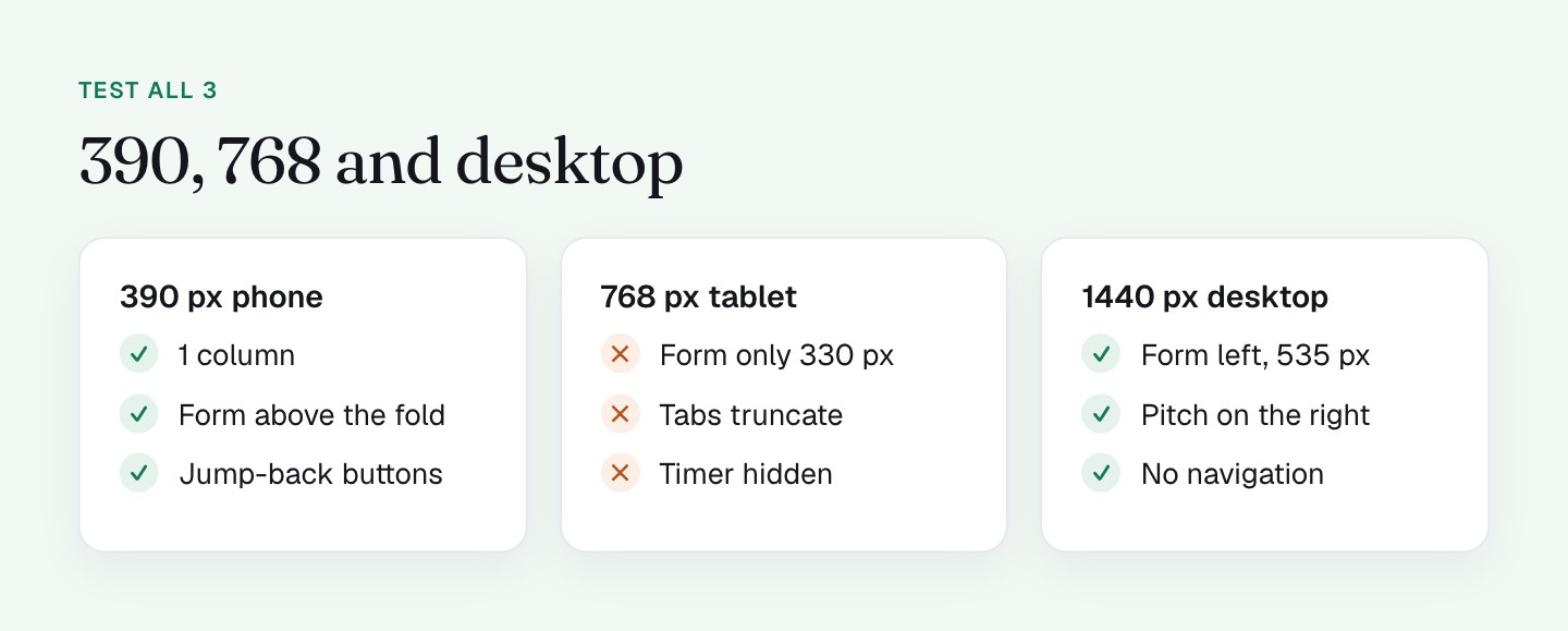
I tested at 390 pixels (iPhone 13 size) and on a Pixel 7 layout. The page stacks into 1 column in this order: header, trust bar, a timer bar, the form, and then the whole sales column with the headline, product mockup, 13 bonuses and testimonials.
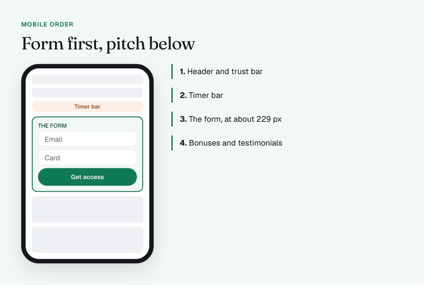
The form starts above the fold, at about 229 pixels from the top. The pitch sits below it, for the buyers who want to read.
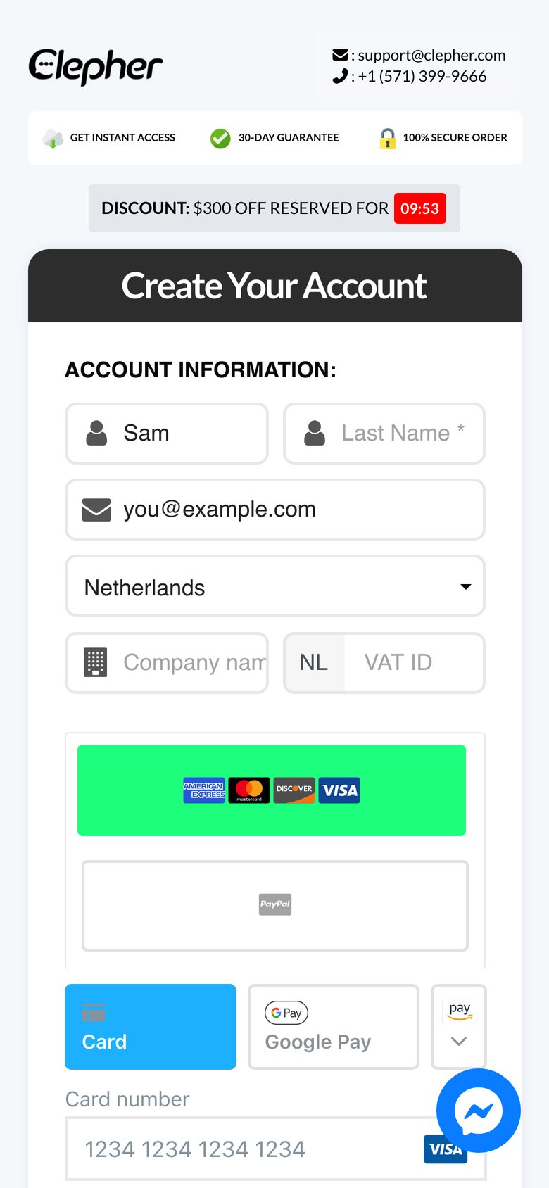
Two more details I like:
- Jump-back buttons. The bonus stack contains 4 "Create your account now" buttons that scroll back up to the form. Someone who finishes reading the bonuses does not have to thumb back up the page. They are hidden on desktop, where they are not needed.
- A shortened trust bar. The "30-day money-back guarantee" line shortens to "30-day guarantee" on mobile. That is the right instinct: say the same thing in less space.
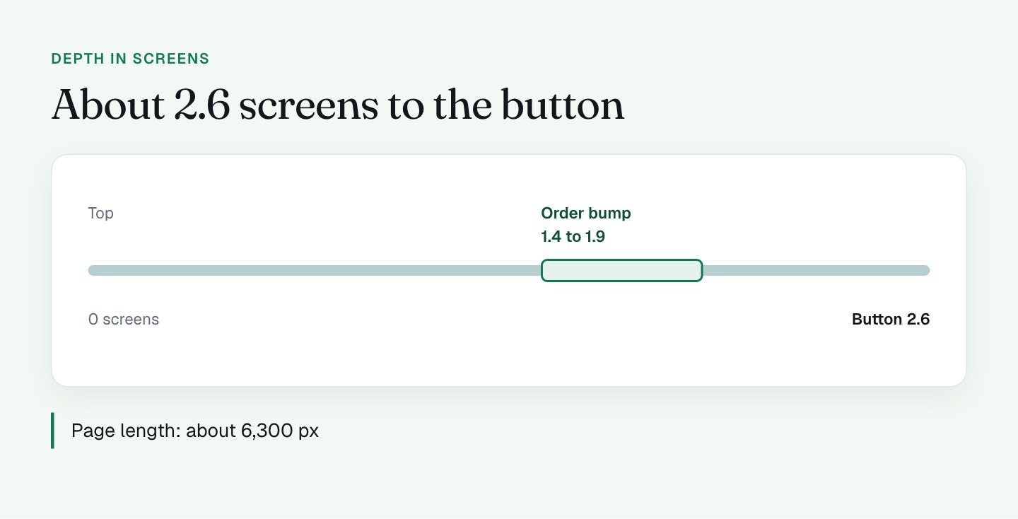
The page is about 6,300 pixels long, and the main button sits around 2,200 pixels down, roughly 2.6 screens. I like to measure depth in screens, because screens are what a thumb feels. A form needs room, and with the form first, the buyer is already working through it as they scroll.
What I'll do differently
The next iteration is about clearing the space around the form. These are the things I'm testing.
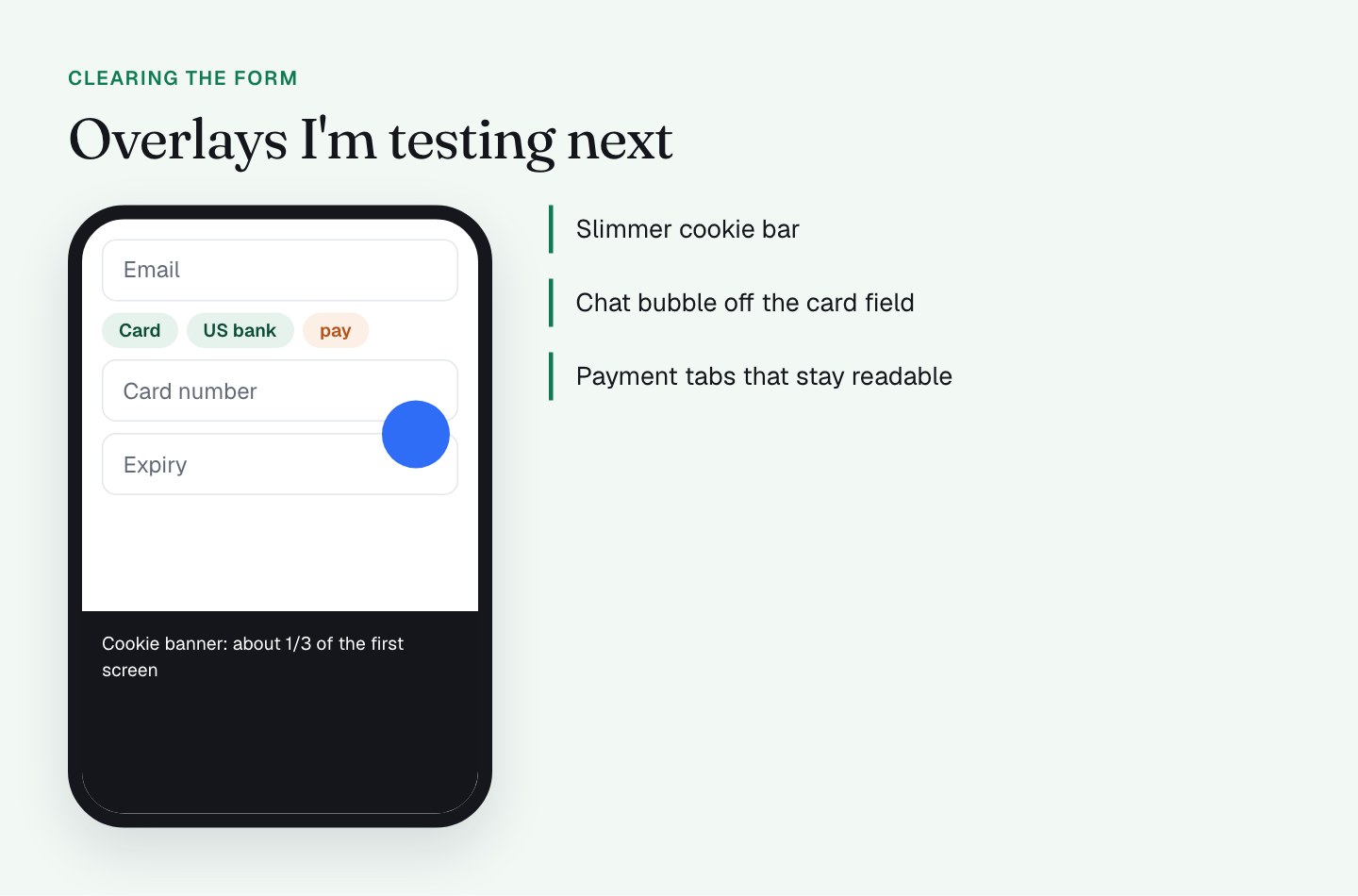
- A slimmer cookie banner. On a first visit it takes about a third of the first screen. Consent is required, so it stays, but I'm looking at a slim bar that leaves the form visible.
- Moving the chat bubble. The Messenger bubble stays on the page, because help is worth having (I wrote about that in part 5, on checkout exits and help). But on a phone it overlaps the payment tabs and later the card field. I'm testing a position that never covers an input, or hiding it until the buyer scrolls past the form.
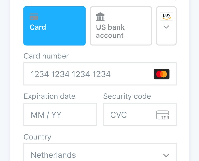
- Fixing the squeezed payment tabs. The Amazon Pay tab collapses into a "pay" stub at 390 pixels. I want every tab readable, or fewer tabs.
How I'd think about any mobile checkout stack
Sort by what blocks the action, what delays it, and what is nice to have.
- Blockers first: overlays and anything covering a field.
- Delays next: content above the form that pushes it down.
- Nice to have last: decorative weight like mockups and long bonus lists. These are fine below the form.
I also decide where the form sits on desktop with the same logic, which I covered in part 4, on form position. Emulation is good for finding layout problems quickly. It will not show you Apple Pay, real keyboard behavior or Safari quirks, so finish on real devices.
What to check on your own checkout
- Measure your button's position in screens (page position divided by screen height), not only in pixels.
- Load the page as a first-time visitor with the cookie banner. How much of the first screen does it take?
- Scroll to the payment fields and see whether any bubble, banner or sticky bar covers them.
- Test at 768 pixels wide. Does anything disappear, truncate or overlap?
- If your page is long, check for buttons that jump back to the form.
- Test your prefilled link on a real iPhone, not just in a desktop browser.
FAQ
Should the form come before the sales copy on a mobile checkout?
Yes, in my view. A mobile checkout visitor tapped a link to pay, so the form should be on the first screen and the sales copy should sit below it. My checkout starts the form at about 229 pixels from the top on a phone.
How far down should the buy button be on mobile?
There is no fixed rule. I measure the button's depth in screens, not pixels. On my checkout the main button sits at about 2.6 screens, which works because the form comes first and the buyer is already filling it in.
What are jump-back buttons on a mobile checkout?
Jump-back buttons are buttons inside a long page that scroll the buyer back up to the form. My checkout has 4 of them in the bonus stack, hidden on desktop, so a buyer who finishes reading can pay without scrolling back.
What breaks most often on a mobile checkout?
Overlays. A cookie banner, a chat bubble or a sticky bar that covers a payment field costs the buyer more than a slightly longer page. I check them first on every phone test.