Form left, pitch right: where your checkout form should sit
The best checkout form position is where the buyer's eyes land first and where they don't have to scroll to act: form left and pitch right on desktop, form first on mobile. My Clepher checkout does both, and here is why that works.
A checkout page has 2 jobs: let people pay, and calm the last doubts before they do. The layout decides which job the buyer meets first, and I think mine gets that order right.
Where should the checkout form go on the page?
The rule I follow is simple: the form is the hero, and the pitch is the supporting cast. Nothing the buyer needs to do should sit behind something they've already decided on.
On a checkout, the visitor has already read the sales page, the email or the ad. They don't need to be sold again before they can act. They need the form in front of them, with the proof within reach.
What I do on my checkout
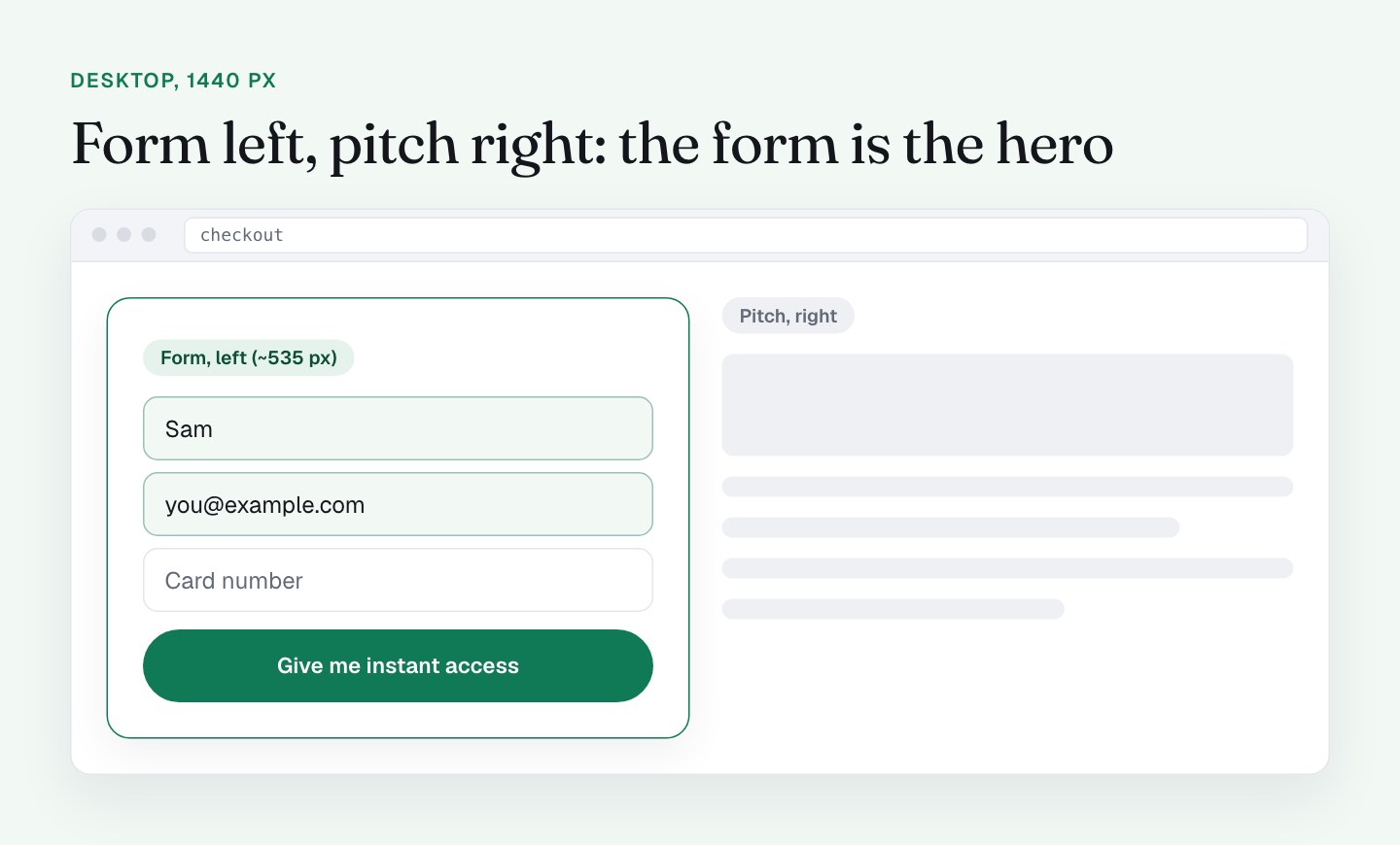
Desktop: form left, pitch right. On a 1440 px screen the page has 2 columns. The form takes the left column (about 535 px wide). The sales stack sits on the right: the product mockup, the bonus list, the testimonials.
I like that for 2 reasons. People in left-to-right languages start at the top left, so the form sits where the eyes land. And the pitch beside it works as company: the buyer can glance across at the bonuses and the proof while they type, without leaving the form. That's my view, not a measured lift for left versus right, but I'd defend it.

Mobile: form first. On a phone (I tested an iPhone 13 profile at 390 px) the columns stack into 1. The order is header, trust bar, countdown bar, then the form, and only then the pitch. The form starts at about 229 px from the top, so it's visible without scrolling.
That's the right call on a small screen. Putting the pitch above the form would mean scrolling past screens of copy to find the place you pay.
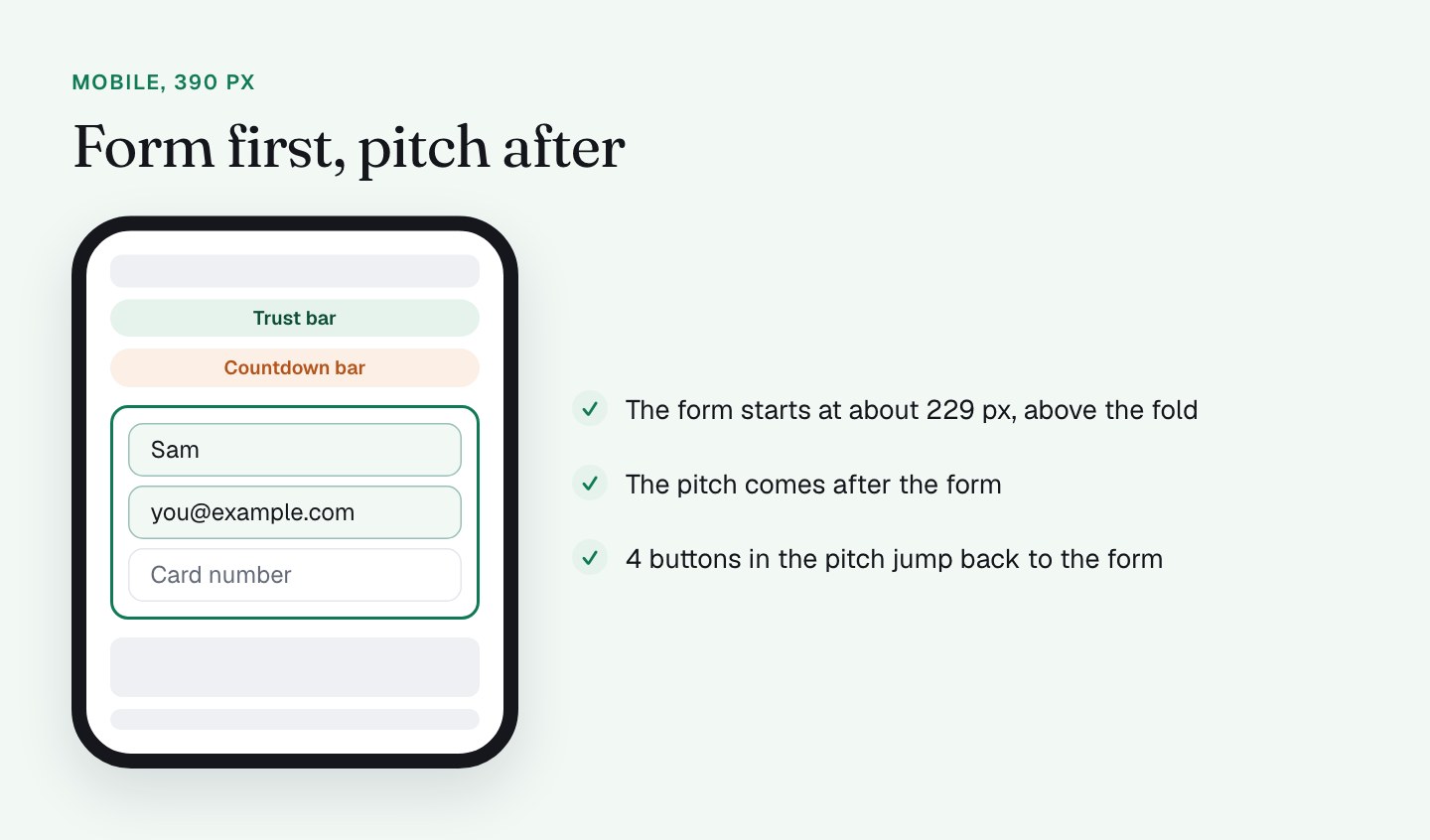
Jump-back buttons. The mobile pitch column has 4 "CREATE YOUR ACCOUNT NOW" buttons that take the reader straight back up to the form. If someone reads down through the bonuses and gets convinced, the form is 1 tap away. They're hidden on desktop, where the form is always in view. This is a pattern I'd recommend to anyone with a long mobile page.
One page, not steps. My checkout is a single form: account details, payment, order bump, coupon, summary and terms, all together. For a one-time purchase I like that, because there's no step 2 to lose people on. In a 2-step checkout the first step is cheap (an email address), which makes sense when the full form is long. Mine isn't that kind of offer, so 1 page fits. I haven't split-tested it, so that's an opinion.
What I'll do differently
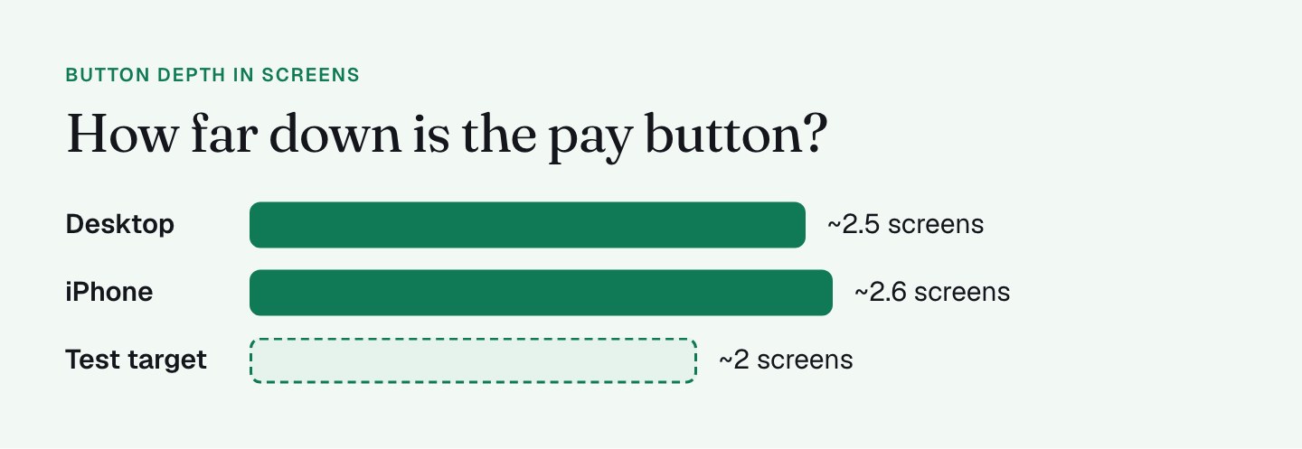
The audit measured the layout, and 3 things stood out as upgrades.
1. Bring the button closer. On desktop the main button ("YES! GIVE ME INSTANT ACCESS") sits at about 2,230 px from the top, roughly 2.5 screens down. On the iPhone it's about 2,200 px, which is 2.6 screens of scrolling, with the order bump at 1.4 to 1.9 screens. I measure depth in screens, not pixels, because that's what a thumb feels. I'm testing what can collapse or move below the button so it lands nearer 2 screens. The page runs about 3,900 px on desktop and about 6,300 px on mobile, with most of that length in the pitch after the form.
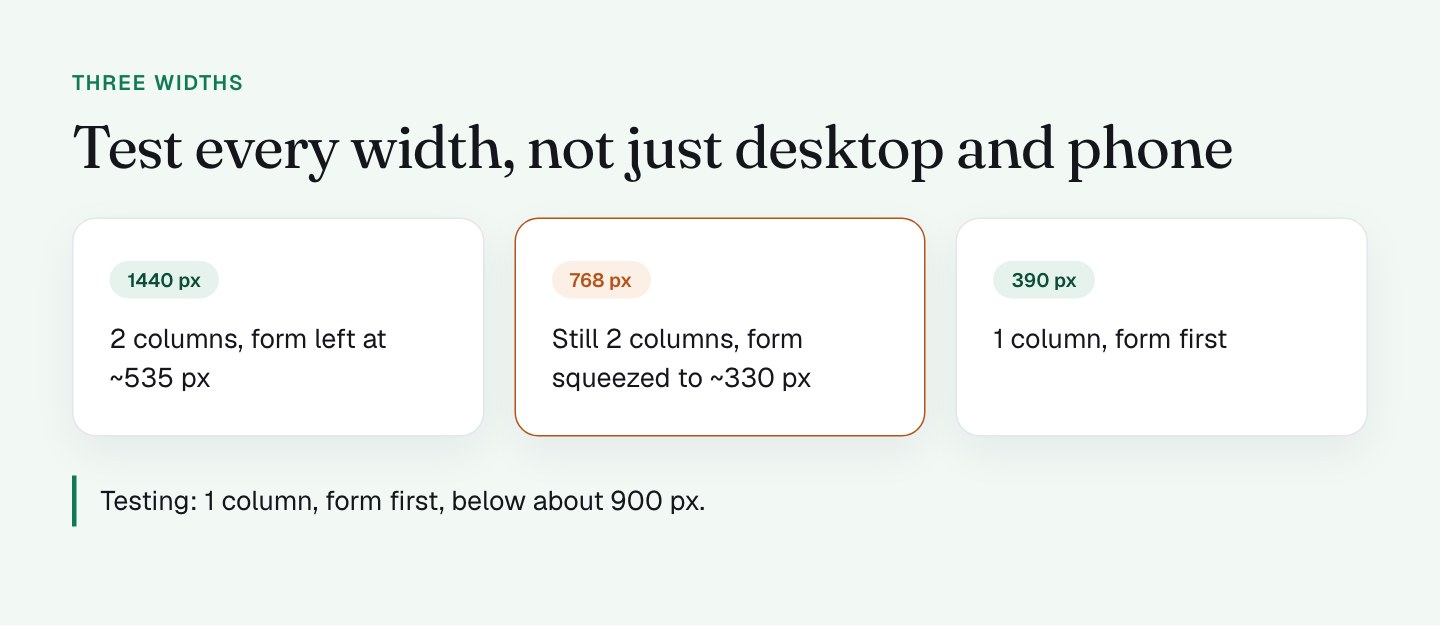
2. Give tablet its own layout. At 768 px the page keeps 2 columns, which narrows the form to about 330 px. The payment tabs truncate and the countdown disappears at that breakpoint. In my experience this is what happens in the gap between the desktop and mobile breakpoints. My plan is to treat anything below about 900 px as a single column with the form first, the same layout that already works on phones.

3. Add a jump-back button near the guarantee. The 4 buttons are in the bonus stack. A 5th next to the guarantee block puts the way back where doubt is highest.
I'd also check the in-between widths by dragging the browser from wide to narrow and watching for the point where something stops fitting. That 1 minute test finds more than most reviews. For the phone side of this, what to sacrifice on mobile goes deeper.
What the layout does for the form itself
Because the form is the first thing on both desktop and mobile, I can keep the rest of the page honest about its job. The bonuses, testimonials and guarantee exist to support the decision. They don't have to carry it.
That also means shortening the form pays off twice: the button moves up and the page feels lighter. The next part of this series covers exactly that: every field is a toll booth. What stays on screen around the form is covered in no navigation, but plenty of help.
What to check on your own checkout
- Open your checkout at 1440, 768 and 390 px wide. Where does the form start at each size?
- Is the form visible without scrolling on a phone?
- How many screens down is your pay button on mobile?
- Drag the window width slowly from wide to narrow. Does anything stop fitting in between?
- If your page is long, can the buyer jump back to the form from the pitch?
- Is the pitch beside the form, or does the buyer have to read it before they can pay?
FAQ
Should the checkout form be on the left or the right?
In my view, on the left. People who read left to right start at the top left, so the form sits where the eyes land and the pitch works as a companion on the right. I haven't measured a lift for left versus right, so I'd test it if you have the traffic.
Should the checkout form come before the sales copy on mobile?
Yes, in my experience. On a phone the columns stack, and putting the pitch first means scrolling past screens of copy to find where you pay. My checkout starts the form at about 229 px from the top and puts the pitch after it.
Is a 1-page checkout better than a 2-step checkout?
It depends on the form. A 2-step checkout suits a long form where the first step is cheap, like an email address. For a one-time purchase with a short form, I'd keep 1 page and shorten the form, though I haven't split-tested it on my page.
How do you check a checkout layout at different screen widths?
Open it at 1440, 768 and 390 px wide and note where the form starts at each size. Then drag the browser window slowly from wide to narrow and watch for the point where something stops fitting. It takes 1 minute and finds the in-between sizes nobody designs for.