No navigation, but plenty of help: keeping buyers focused
Checkout page navigation means the menu, logo links and footer links around your payment form. My view: remove everything that leads away from paying, and keep everything that answers a question. My Clepher checkout does exactly that.
Every link on a checkout page is a way out. A menu, a logo that goes to the home page, a footer full of blog categories: each 1 invites the buyer to wander off with their card still in their pocket.
Should you remove navigation from a checkout page?
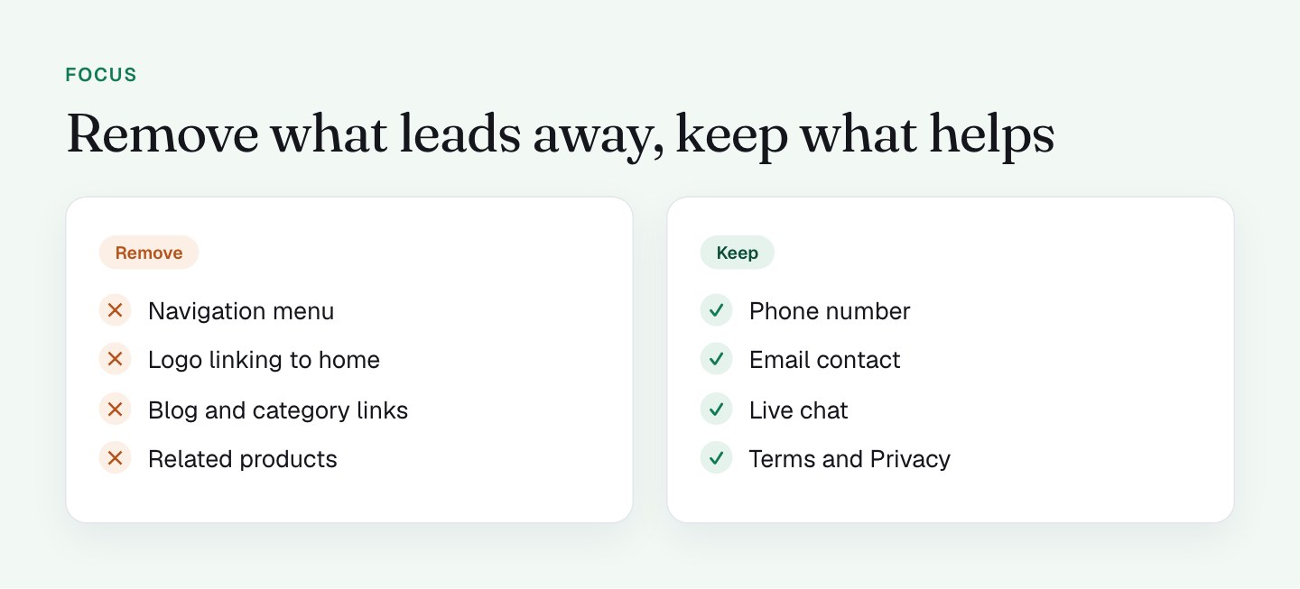
The standard advice is to strip the navigation from a checkout. I agree, and I'd add the other half: don't strip the ways to ask a question.
Someone at the checkout has already decided they're interested. What can still stop them is a small doubt ("does this work with my setup?" or "what happens to my card in 30 days?"). If the only way to resolve that is to open a new tab and search, there's a good chance the tab never gets closed again. If there's a visible phone number or chat, the question gets asked right there.
So the rule is: links that take the buyer away get removed. Links that answer a question stay.
What I do on my checkout
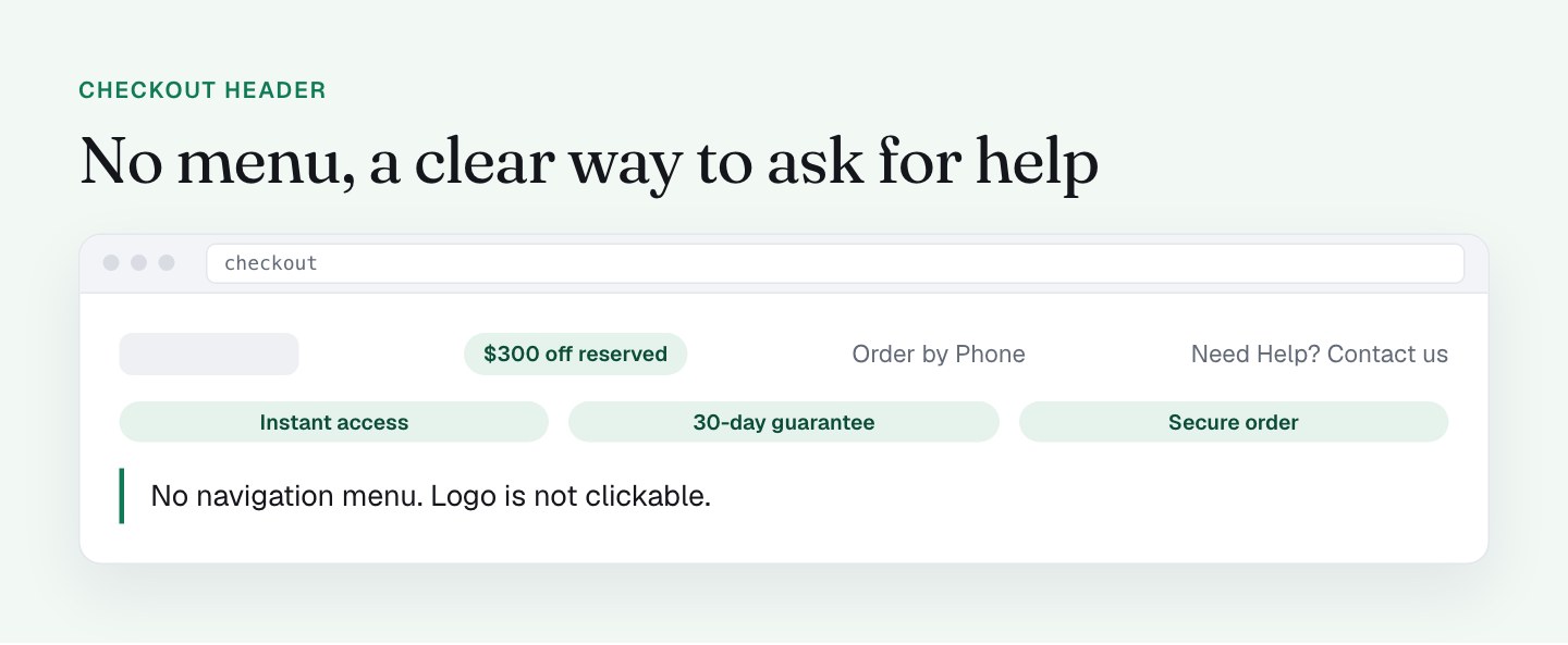
The header has no navigation menu, and the logo isn't clickable. What I show instead:
- A gray pill with the discount and countdown.
- "Order by Phone" with a number.
- "Need Help? Click Here to Contact Us" (an email link).
- A trust bar: instant access, 30-day money-back guarantee, secure order.

On the page itself, the ways to reach a person are the email link, the phone number, and a Messenger chat bubble in the bottom right corner. The footer keeps Terms, Privacy and Cookie policy, which belong there on a page that takes payment. There is no site navigation anywhere.
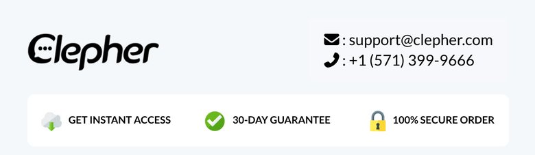
The layout side of this is in form left, pitch right. The effect is a page with 1 clear direction. The buyer's eyes go to the form, and any hesitation has a visible, human answer. A phone number on a checkout also says something on its own: there's a real company behind this.
What I'll do differently
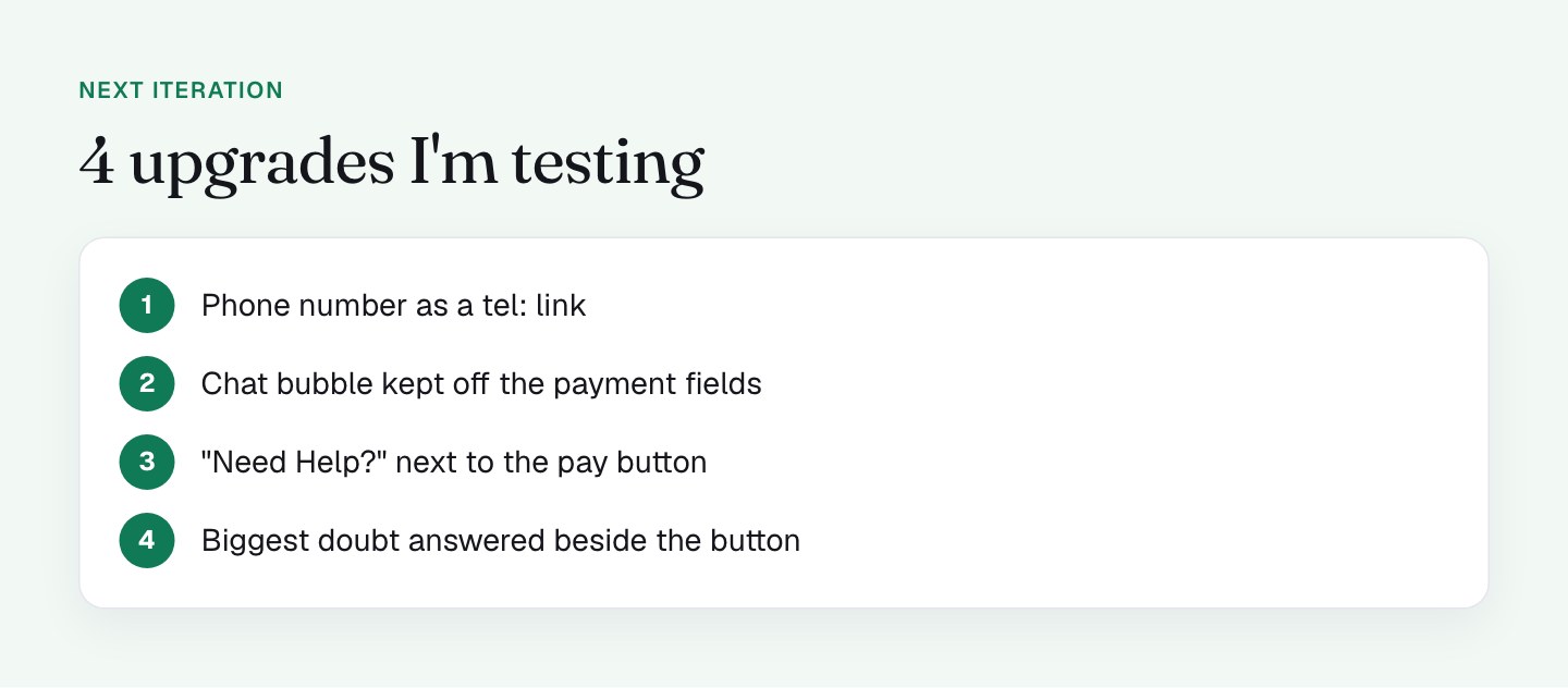
The audit gave me 4 upgrades. They build on what's working, so I'm approaching them as tests.
1. Make the phone number a tel: link. On desktop it's plain text. That's fine on a laptop, but on a phone the number should place a call with 1 tap. On mobile my header shows phone and email as icons, and I'll confirm the phone icon dials when tapped. The goal is that the person who wants to call can do it in 1 step.
2. Give the chat bubble room. On mobile, the Messenger bubble sits over the payment tabs and later the card field. The bubble is a good idea, and I want it to help without covering anything. I'm testing hiding it while the form is in view, or moving it so it never sits on the payment fields. Another option is a small "Questions?" link in the header that opens the chat on demand.
3. Move "Need Help?" closer to the button. The header is where help lives now. The moment of doubt tends to come right before paying, so I'm testing a 1-line help prompt beside the button.
4. Answer the biggest doubt in place. If the most common question is about the future charge or the refund, a single line next to the button can answer it before the buyer reaches for the phone. Fewer questions to the chat means more time on the form.
I'm keeping the logo unclickable and the footer legal links as they are.
Overlays count as exits too
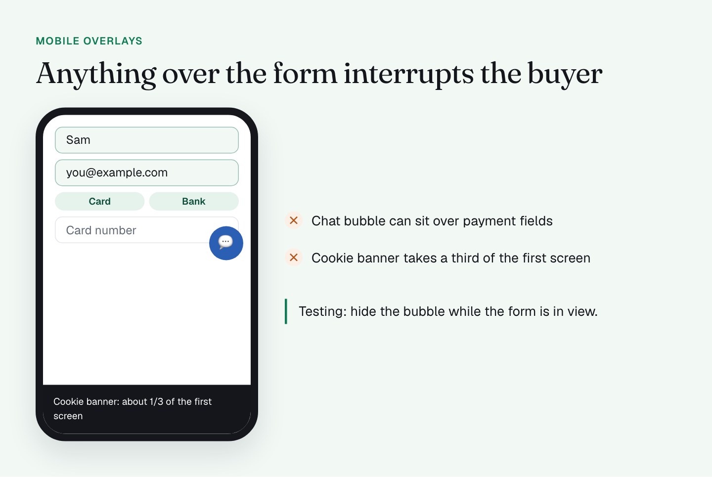
Anything that sits over the form interrupts the buyer, even if it isn't a link. On a first visit the cookie banner takes about a third of the first screen on mobile and covers part of the payment area on desktop. Consent Mode is set up properly, and I want to keep it that way. Next I'm testing a smaller banner. I'll cover consent in the last part of the series.
On a real phone, the combination to test is a first visit, the cookie banner showing and the chat bubble loaded. How much of the form can you see? I go deeper in what to sacrifice on mobile.
A word on the timer
My checkout also has a countdown timer and, separately, a redirect to the sales page after 10 minutes. Both belong in their own post, the part on countdown timers. I mention it here because a redirect is the one exit the buyer doesn't choose, so I'm testing it first.
What to check on your own checkout
- Count every clickable thing above the button. Which ones lead away from paying?
- Is there a visible way to ask a question (phone, email or chat) without leaving the page?
- Is your phone number a
tel:link? Tap it on a real phone. - Does a chat bubble, banner or popup cover any form field or the pay button on mobile?
- Is the logo clickable? Where does it go?
- Are Terms and Privacy still in the footer?
FAQ
Should you remove navigation from a checkout page?
Yes. A menu, a clickable logo and category links give the buyer reasons to leave before paying. Keep the legal links in the footer, and keep the ways to ask a question.
What should stay on a checkout page besides the form?
A phone number, an email contact and live chat, plus Terms and Privacy links. These answer doubts without sending the buyer to another site. On my checkout the header shows "Order by Phone" and "Need Help?", and a Messenger chat bubble sits in the corner.
Should a phone number on a checkout page be a tel: link?
Yes, at least on mobile. A tel: link lets a buyer place a call with 1 tap instead of copying the number into another app. On my checkout the desktop number is plain text, and I'm confirming that the mobile phone icon dials when tapped.
Can a chat widget get in the way of a checkout form?
It can if it covers the form. On my mobile checkout the Messenger bubble sits over the payment tabs and later the card field. I'm testing hiding it while the form is in view, or moving it away from the payment fields.