Checkout social proof: calm the last doubt
Social proof on a checkout page should calm the last doubt, not sell the product. The sales page already did the selling, so the checkout only needs a short, specific, believable line close to the pay button.
My Clepher checkout puts proof right next to the form, and I think that's a big part of why people finish the purchase.
Why does social proof matter at the point of payment?
Most people don't want to hear this: on a checkout, testimonials are not persuasion. They're reassurance. The buyer has already said yes in their head, and they're looking for a reason to feel fine about it.
That changes what good proof looks like. It should be quick to read, specific and close to where the doubt shows up. A short line with a real result does more than a long story, because the buyer can compare it to their own situation in 3 seconds.
What I do on my checkout
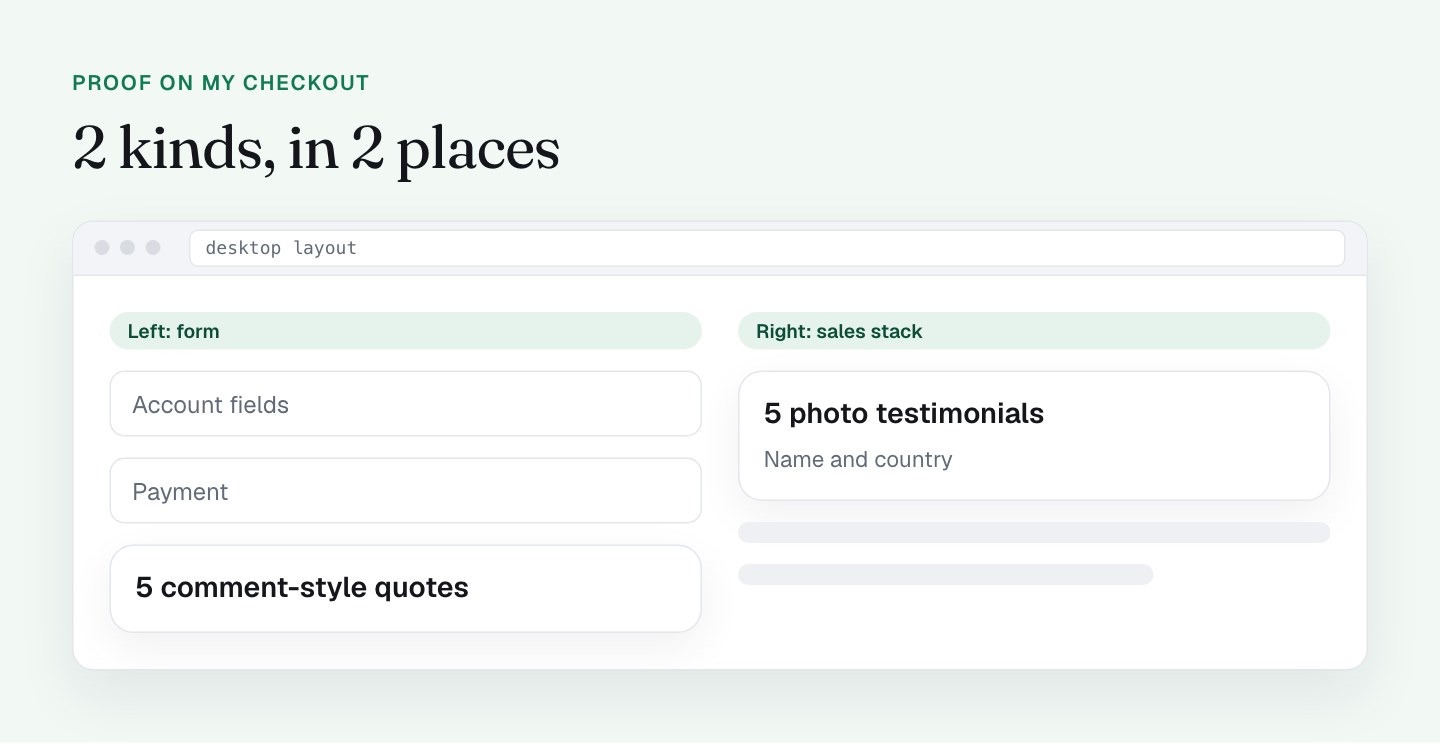
There are 2 kinds of proof on the page, and they work together.
5 star-rated photo testimonials in the right column. Each has a first and last name and a country. On desktop the right column sits beside the form, so the proof is in view while the buyer fills it in. The testimonials are spread between the bonuses, 1 after every 3 or 4 items, so they appear as the buyer reads down the stack.
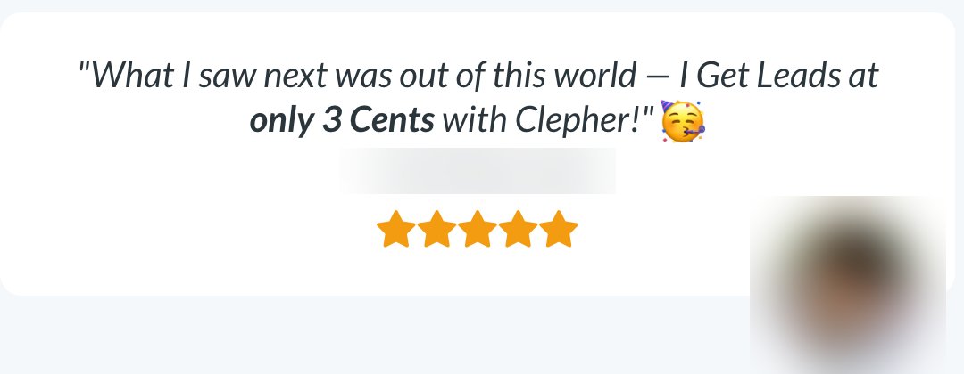
5 Facebook-comment style quotes under the guarantee. Avatar, name, 1 line and a like count. This format feels like a real conversation, not an ad, and it sits in the left column near the form.

Specific claims. Lines like "Leads at only 3 Cents," "98% Open Rate" and a story about selling a car with a QR code give buyers something concrete to picture. That's what specific proof does, and it's why I prefer it to generic praise.
An honest disclaimer. The footer says some customers "may have received incentives." I like that. It builds trust with the people who read it, and I'd keep it.
Purchase notifications. The page also loads Provely for purchase popups, after cookie consent. I couldn't verify in my audit whether the testimonials or the popups are tied to live data, so I'm making no claims about them here. This post is about where proof goes and what shape it takes.
Where should testimonials go on a checkout page?
As close to the pay button as you can get them. The page already has proof, so next I'm moving some of it to the moment of payment.
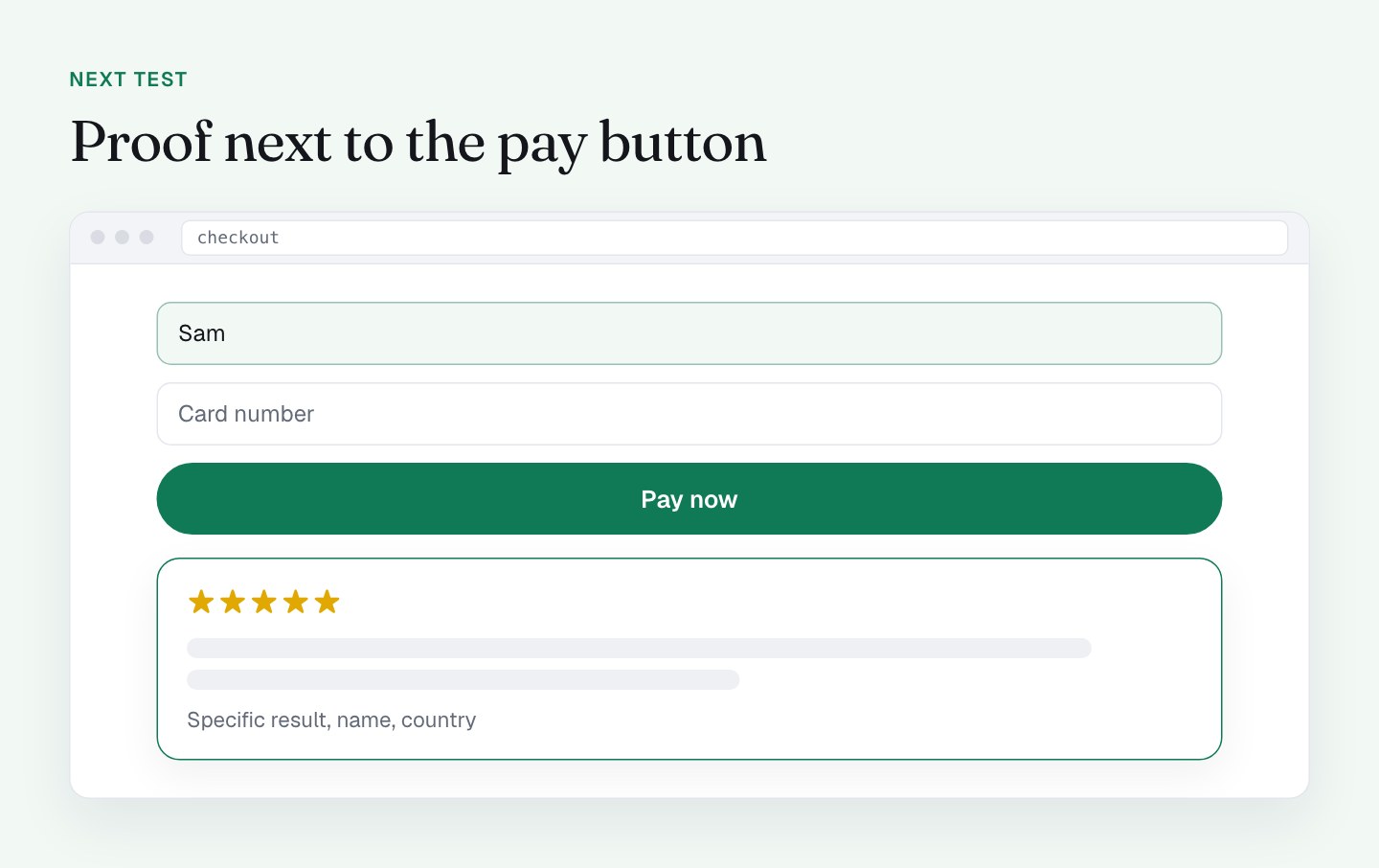
I'm testing 1 proof element directly next to the pay button. My strongest specific testimonial, with name, country and photo, right above or below the CTA. On mobile the button sits about 2.6 screens down, so the closest reassurance is a scroll away. I want it in the same view as the button. I wrote about that depth in the post on mobile checkout.
What I'll do differently
I'm adding a 1-line number badge. Something like a customer count or a rating from a platform I don't control, with a link to back it up. A single line is easy to scan and hard to argue with. I only want a number I can show a source for.
I'm matching proof to the objection. If a buyer hesitates over the bump, the best proof is a quote about the bump. Next I'm testing a short Pro quote inside the bump box, which ties into my post on order bumps.
I'm testing the popups on and off. A purchase popup is a good tool on a sales page. On a checkout the buyer is mid-task, and anything that appears over the form competes with the card fields. I'll compare completed purchases with and without them, and make sure they can never cover the form on a phone. If the data behind them isn't current and real, they come off.
I'm keeping the long stack where it belongs. The 5 photo testimonials are strong sales content. The checkout needs a recap, with the full set living on the sales page.
Proof and guarantee are a pair
Proof says "other people got results." The guarantee says "and if you don't, you get your money back." They answer the same doubt from 2 sides, so I want them close together. I'll cover the guarantee in the next post.
What to check on your own checkout
- Find the proof closest to your pay button. How many screens away is it on a phone?
- Is there 1 number (customers, rating, reviews) in a single line near the form?
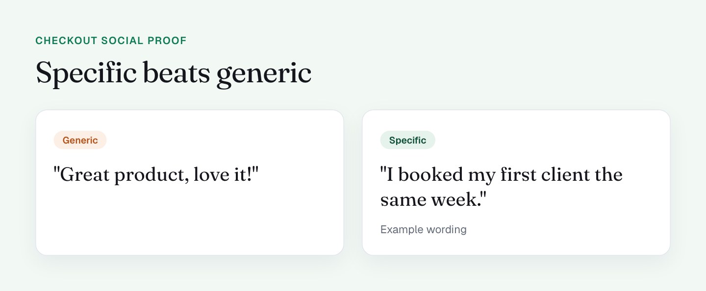
- Are your testimonials specific (a result, a number, a situation) or generic praise?
- Does your page disclose incentivized reviews, if you have any?
- If you run purchase popups, do they ever cover the form? Check on a phone.
- Can you back every claim with a link or a screenshot if a buyer asks?
FAQ
Should I put testimonials on my checkout page?
Yes, but keep them short and place them close to the form or the pay button. Testimonials on a checkout calm the last doubt, so a recap of your strongest, most specific proof works better than the full stack from your sales page.
What kind of social proof works best at checkout?
Specific proof works best: a named person, a country and a concrete result. A 1-line badge with a customer count or a rating from a platform you don't control also works, as long as you can show a source for the number.
Do social proof popups help or hurt a checkout?
It depends on your page, so I'd test them on and off and compare completed purchases. On a checkout the buyer is mid-task, and a popup that appears over the form competes with the card fields, especially on a phone.
Is it okay to use incentivized testimonials?
I'd always disclose them, and check the advertising rules in your market. My checkout footer states that some customers "may have received incentives," and I'd keep a disclosure like that on any page where it applies.